Basic example
In the following example you can see the button that will trigger the tooltip element to be shown when hovered or focused.

<div>
    Hover the link to see the
    <a href="#" class="text-link" data-te-toggle="tooltip" title="Hi! I'm tooltip">tooltip</a>
</div>
Placement
Tooltip can be triiggered on all 4 sides.
<!-- Top -->
<button
    type="button"
    class="btn mr-1 mt-1 bg-blue-600/90 text-md text-white hover:bg-blue-600"
    data-te-toggle="tooltip"
    data-te-placement="top"
    title="Tooltip on top"
>
    Tooltip on top
</button>

<!-- Right -->
<button
    type="button"
    class="btn mr-1 mt-1 bg-blue-600/90 text-md text-white hover:bg-blue-600"
    data-te-toggle="tooltip"
    data-te-placement="right"
    title="Tooltip on right"
>
    Tooltip on right
</button>

<!-- Bottom -->
<button
    type="button"
    class="btn mr-1 mt-1 bg-blue-600/90 text-md text-white hover:bg-blue-600"
    data-te-toggle="tooltip"
    data-te-placement="bottom"
    title="Tooltip on bottom"
>
    Tooltip on bottom
</button>

<!-- Left -->
<button
    type="button"
    class="btn mr-1 mt-1 bg-blue-600/90 text-md text-white hover:bg-blue-600"
    data-te-toggle="tooltip"
    data-te-placement="left"
    title="Tooltip on left"
>
    Tooltip on left
</button>
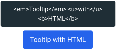
With custom HTML
Tooltips can contain any arbitrary HTML, Angular bindings and even directives.
<button
    type="button"
    class="btn mr-1 mt-1 bg-blue-600/90 text-md text-white hover:bg-blue-600"
    data-te-toggle="tooltip"
    title="<em>Tooltip</em> <u>with</u> <b>HTML</b>"
>
    Tooltip with HTML
</button>