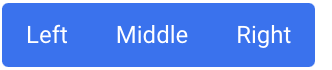
Basic example
Group a series of buttons together on a single line using the following code.
<div class="inline-flex items-center text-md text-white" role="group">
    <button type="button" class="btn rounded-r-none bg-blue-600/90 hover:bg-blue-600">Left</button>
    <button type="button" class="btn rounded-none bg-blue-600/90 hover:bg-blue-600">Middle</button>
    <button type="button" class="btn rounded-l-none bg-blue-600/90 hover:bg-blue-600">Right</button>
</div>
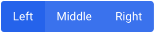
Active state
Use stronger color shade to indicate the actibe state.
<div class="inline-flex items-center text-md text-white" role="group">
    <button type="button" class="btn rounded-r-none bg-blue-600">Left</button>
    <button type="button" class="btn rounded-none bg-blue-600/90 hover:bg-blue-600">Middle</button>
    <button type="button" class="btn rounded-l-none bg-blue-600/90 hover:bg-blue-600">Right</button>
</div>
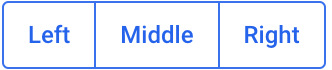
Outlined Buttons
Outlined button groups are possible using Tailwind’d border classes.
<div class="inline-flex items-center rounded border border-blue-600/90 text-md font-bold text-blue-600" role="group">
    <button type="button" class="btn rounded-none hover:bg-blue-600 hover:text-white">Left</button>
    <button type="button" class="btn rounded-none border-x border-blue-600/90 hover:bg-blue-600 hover:text-white">Middle</button>
    <button type="button" class="btn rounded-none hover:bg-blue-600 hover:text-white">Right</button>
</div>
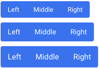
Sizing
Use sizing classes to scale the button groups easily.
<!-- Extra small -->
<div class="mb-2 flex items-center text-xs text-white" role="group">
    <button type="button" class="btn h-6 rounded-r-none bg-blue-600/90 hover:bg-blue-600">Left</button>
    <button type="button" class="btn h-6 rounded-none bg-blue-600/90 hover:bg-blue-600">Middle</button>
    <button type="button" class="btn h-6 rounded-l-none bg-blue-600/90 hover:bg-blue-600">Right</button>
</div>

<!-- Small -->
<div class="mb-2 flex items-center text-sm text-white" role="group">
    <button type="button" class="btn h-7 rounded-r-none bg-blue-600/90 hover:bg-blue-600">Left</button>
    <button type="button" class="btn h-7 rounded-none bg-blue-600/90 hover:bg-blue-600">Middle</button>
    <button type="button" class="btn h-7 rounded-l-none bg-blue-600/90 hover:bg-blue-600">Right</button>
</div>

<!-- Default -->
<div class="mb-2 flex items-center text-md text-white" role="group">
    <button type="button" class="btn rounded-r-none bg-blue-600/90 hover:bg-blue-600">Left</button>
    <button type="button" class="btn rounded-none bg-blue-600/90 hover:bg-blue-600">Middle</button>
    <button type="button" class="btn rounded-l-none bg-blue-600/90 hover:bg-blue-600">Right</button>
</div>

<!-- Large -->
<div class="flex items-center text-white" role="group">
    <button type="button" class="btn h-9 rounded-r-none bg-blue-600/90 hover:bg-blue-600">Left</button>
    <button type="button" class="btn h-9 rounded-none bg-blue-600/90 hover:bg-blue-600">Middle</button>
    <button type="button" class="btn h-9 rounded-l-none bg-blue-600/90 hover:bg-blue-600">Right</button>
</div>
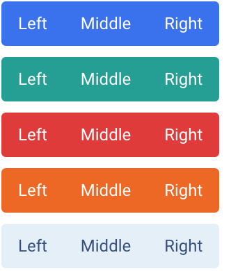
Colors
Choose from several predefined button group styles, each serving its own semantic purpose, with a few extras thrown in for more control.
<!-- Primary -->
<div class="mb-2 flex items-center text-md text-white" role="group">
    <button type="button" class="btn rounded-r-none bg-blue-600/90 hover:bg-blue-600">Left</button>
    <button type="button" class="btn rounded-none bg-blue-600/90 hover:bg-blue-600">Middle</button>
    <button type="button" class="btn rounded-l-none bg-blue-600/90 hover:bg-blue-600">Right</button>
</div>

<!-- Success -->
<div class="mb-2 flex items-center text-md text-white" role="group">
    <button type="button" class="btn rounded-r-none bg-teal-600/90 hover:bg-teal-600">Left</button>
    <button type="button" class="btn rounded-none bg-teal-600/90 hover:bg-teal-600">Middle</button>
    <button type="button" class="btn rounded-l-none bg-teal-600/90 hover:bg-teal-600">Right</button>
</div>

<!-- Danger -->
<div class="mb-2 flex items-center text-md text-white" role="group">
    <button type="button" class="btn rounded-r-none bg-red-600/90 hover:bg-red-600">Left</button>
    <button type="button" class="btn rounded-none bg-red-600/90 hover:bg-red-600">Middle</button>
    <button type="button" class="btn rounded-l-none bg-red-600/90 hover:bg-red-600">Right</button>
</div>

<!-- Warning -->
<div class="mb-2 flex items-center text-md text-white" role="group">
    <button type="button" class="btn rounded-r-none bg-orange-600/90 hover:bg-orange-600">Left</button>
    <button type="button" class="btn rounded-none bg-orange-600/90 hover:bg-orange-600">Middle</button>
    <button type="button" class="btn rounded-l-none bg-orange-600/90 hover:bg-orange-600">Right</button>
</div>

<!-- Secondary -->
<div class="flex items-center text-md" role="group">
    <button type="button" class="btn rounded-r-none bg-light-200 hover:bg-light-300 dark:bg-dark-200 dark:hover:bg-dark-300">Left</button>
    <button type="button" class="btn rounded-none bg-light-200 hover:bg-light-300 dark:bg-dark-200 dark:hover:bg-dark-300">Middle</button>
    <button type="button" class="btn rounded-l-none bg-light-200 hover:bg-light-300 dark:bg-dark-200 dark:hover:bg-dark-300">Right</button>
</div>