Autosize Textarea
Automatically adjust textarea height based on the content.

<textarea data-autosize class="form-control flex" placeholder="What's on your mind, Malinda Hollaway?"></textarea>
- JS file:
/src/assets/js/vendors/autoSize.js - Plugin documentation: https://www.jacklmoore.com/autosize/
Input Mask
Input masks can be used to force the user to enter data conform a specific format. This can be useful for dates, numerics, phone numbers, etc.
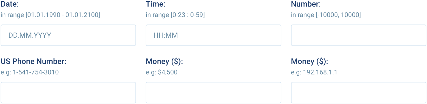
<!-- Date: -->
<input type="text" class="form-control" id="mask-date" placeholder="DD.MM.YYYY" />

<!-- Time -->
<input type="text" class="form-control" id="mask-time" placeholder="HH:MM" />

<!-- Number -->
<input type="text" class="form-control" id="mask-number" />

<!-- US Phone -->
<input type="text" class="form-control" id="mask-us-phone" />

<!-- Money -->
<input type="text" class="form-control" id="mask-money" />

<!-- IP Address -->
<input type="text" class="form-control" id="mask-ip" />
- JS file:
/src/assets/js/vendors/imask.js - Plugin documentation: https://imask.js.org/
Custom Select
Automatically adjust textarea height based on the content.

<!-- Basic -->
<select class="custom-select" id="custom-select-basic">
	<option value="1">First Option</option>
	<option value="2">Second Option</option>
	<option value="3">Third Option</option>
	<option value="4">Fourth Option</option>
	<option value="5">Fifth Option</option>
</select>

<!-- Multiple -->
<select class="custom-select" id="custom-select-multiple" multiple>
	<option value="1">First Option</option>
	<option value="2">Second Option</option>
	<option value="3">Third Option</option>
	<option value="4">Fourth Option</option>
	<option value="5">Fifth Option</option>
</select>

<!-- Searchable -->
<select class="custom-select" id="custom-select-searchable">
	<option value="1">First Option</option>
	<option value="2">Second Option</option>
	<option value="3">Third Option</option>
	<option value="4">Fourth Option</option>
	<option value="5">Fifth Option</option>
</select>
- JS file:
/src/assets/js/vendors/niceSelect2.js - Plugin documentation: https://bluzky.github.io/nice-select2/
Drag and Drop file upload
Automatically adjust textarea height based on the content.

<form id="drag-drop-upload" class="dropzone" action="/" enctype="multipart/form-data" method="post">
	<div class="dz-message">
		<i class="icon -mt-3 inline-block text-4xl font-light">cloud_upload</i>
		<div data-dz-message>Drag and drop files here to upload</div>
	</div>
</form>
- JS file:
/src/assets/js/vendors/dropzone.js - Plugin documentation: https://www.dropzone.dev/
Color Picker
Color picker is a component that allows users to select a color. It can be used in forms, or anywhere else a color needs to be selected.
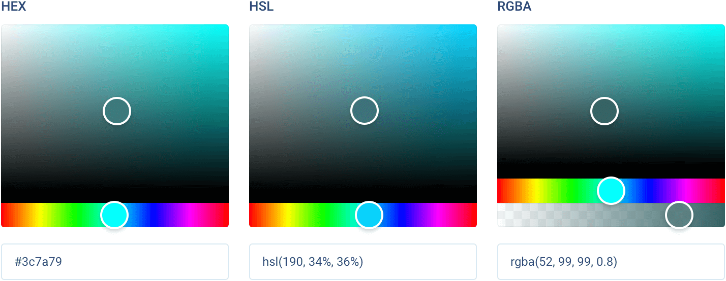
<!-- HEX -->
<div>
	<hex-color-picker class="color-picker mb-4" color="#3c7a79"></hex-color-picker>
	<input type="text" class="form-control" readonly value="#3c7a79" id="hex-input" />
</div>

<!-- HSL -->
<div>
	<hsl-string-color-picker class="color-picker mb-4" color="hsl(190, 34%, 36%)"></hsl-string-color-picker>
	<input type="text" class="form-control" readonly value="hsl(190, 34%, 36%)" id="hsl-input" />
</div>

<!-- RGBA -->
<div>
	<rgba-string-color-picker class="color-picker mb-4" color="rgba(52, 99, 99, 0.8)"></rgba-string-color-picker>
	<input type="text" class="form-control" readonly value="rgba(52, 99, 99, 0.8)" id="rgba-input" />
</div>
- JS file:
/src/assets/js/vendors/vanillaColorful.js - Plugin documentation: https://iamkulykov.com/vanilla-colorful/
Rich Text Editor
WYSIWYG editor for rich text contents which support for embedded attachments, and outputs terse and consistent HTML.
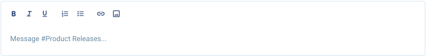
<div class="text-editor rounded border border-light-300 dark:border-dark-300">
	<div class="quill" data-placeholder="Type something..."></div>
</div>
- JS file:
/src/assets/js/vendors/quill.js - Official documentation: https://quilljs.com/
Range Slider
WYSIWYG editor for rich text contents which support for embedded attachments, and outputs terse and consistent HTML.
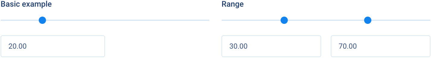
<!-- Basic -->
<div>
	<div class="input-slider mb-6" id="slider-basic"></div>
	<input type="text" class="form-control w-6/12" id="slider-basic-input" />
</div>

<!-- Range -->
<div>
	<div class="input-slider mb-6" id="slider-range"></div>
	<div class="grid grid-cols-2 gap-4">
		<input type="text" class="form-control" id="slider-range-upper-input" />
		<input type="text" class="form-control" id="slider-range-lower-input" />
	</div>
</div>
- JS file:
/src/assets/js/vendors/noUiSlider.js - Official documentation: https://refreshless.com/nouislider/
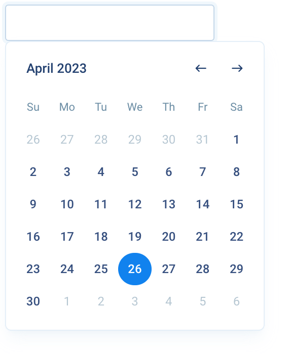
Datepicker
The datepicker allows users to enter a date either through text input, or by choosing a date from the calendar. Date pickers can be embedded into dialogs on mobile and text field dropdowns on desktop.
<!-- Basic -->
<div class="relative">
	<label for="datepicker-basic" class="mb-2 block font-bold text-heading">Basic datepicker</label>
	<input id="datepicker-basic" type="text" class="form-control date-picker" />
</div>

<!-- With icon -->
<div class="relative">
	<label for="datepicker-lg" class="mb-2 block font-bold text-heading">With icon indicator</label>
	<div class="form-control mb-4 flex items-center px-0">
		<span class="icon border-r border-light-400 px-2 dark:border-dark-300">today</span>
		<input id="datepicker-lg" type="text" class="date-picker h-full flex-1 bg-transparent px-3" />
	</div>
</div>

<!-- Range -->
<div class="relative">
	<label class="mb-2 block font-bold text-heading">Range</label>
	<div class="date-range-picker relative flex items-center">
		<input type="text" name="start" class="form-control" />
		<i class="icon mx-2 text-base">east</i>
		<input type="text" name="end" class="form-control" />
	</div>
</div>

<!-- Inline -->
<div class="relative">
	<label class="mb-2 block font-bold text-heading">Inline</label>
	<div class="w-64 rounded border border-light-200 px-4 py-3 dark:border-dark-200">
		<div class="date-picker"></div>
	</div>
</div>
- JS file:
/src/assets/js/vendors/vanillajsDatepicker.js - Official documentation: https://github.com/mymth/vanillajs-datepicker