Input
Input controls are styled with a mix of Sass and Tailwind classes, allowing them to adapt to color modes and support any customization method.
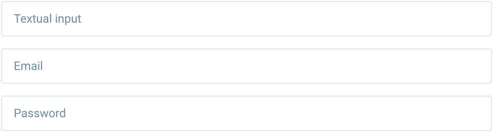
<input type="text" class="form-control" placeholder="Textual input" />
<input type="email" class="form-control" placeholder="Email" />
<input type="password" class="form-control" placeholder="Password" />
Sizing
Using height, padding, and font-size utilities, you can easily change the size of an input.
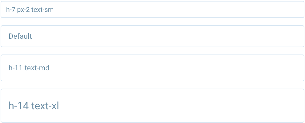
<input type="text" class="form-control mb-3 h-7 px-2 text-sm" placeholder="h-7 px-2 text-sm" />
<input type="text" class="form-control" placeholder="Default" />
<input type="text" class="form-control h-11 text-md" placeholder="h-11 text-md" />
<input type="text" class="form-control h-14 text-xl" placeholder="h-14 text-xl" />
Disabled
Disabled inputs are styled with the disabled attribute.

<input type="text" class="form-control" placeholder="Disabled input" disabled />
Select
Basic select component allows you to choose from a number of options.

<div class="select">
    <select class="form-control">
        <option selected>Open this select menu</option>
        <option value="1">One</option>
        <option value="2">Two</option>
        <option value="3">Three</option>
    </select>
</div>
Disabled
Disabled select are styled with the disabled attribute.

<div class="select">
    <select class="form-control" disabled>
        <option selected>Open this select menu</option>
        <option value="1">One</option>
        <option value="2">Two</option>
        <option value="3">Three</option>
    </select>
</div>
Textarea
Textarea component allows you to enter multiple lines of text.
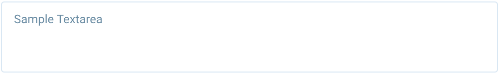
<textarea class="form-control" rows="3" placeholder="Sample Textarea"></textarea>
Disabled
Disabled textarea are styled with the disabled attribute.
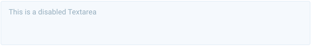
<textarea class="form-control" rows="3" disabled>This is a disabled Textarea</textarea>
Checkbox
Checkboxes are used to let a user select one or more options of a limited number of choices
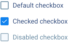
<!-- Default -->
<div class="flex items-center">
    <input type="checkbox" id="cb-1" class="checkbox mr-2" />
    <label for="cb-1">Default checkbox</label>
</div>

<!-- Checked -->
<div class="flex items-center">
    <input type="checkbox" id="cb-2" class="checkbox mr-2" checked />
    <label for="cb-2">Checked checkbox</label>
</div>

<!-- Disabled -->
<div class="flex items-center">
    <input type="checkbox" id="cb-3" class="checkbox mr-2" disabled />
    <label for="cb-3" class="text-muted">Disabled checkbox</label>
</div>
Radio
Radio buttons are used to let a user select one option from a set.
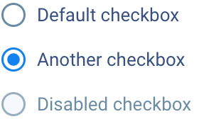
<!-- Default -->
<div class="flex items-center">
    <input type="radio" name="rb" id="rb-1" class="radio mr-2" />
    <label for="rb-1">Default checkbox</label>
</div>

<!-- Checked -->
<div class="flex items-center">
    <input type="radio" name="rb" id="rb-2" class="radio mr-2" checked />
    <label for="rb-2">Another checkbox</label>
</div>

<!-- Disabled -->
<div class="flex items-center">
    <input type="radio" name="rb" id="rb-3" class="radio mr-2" disabled />
    <label for="rb-3" class="text-muted">Disabled checkbox</label>
</div>
Switch
Switches toggle the state of a single setting on or off.
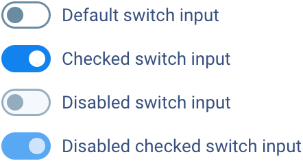
<!-- Default -->
<div class="switch flex items-center">
    <input id="switch-default" type="checkbox" class="switch-checkbox" />
    <label for="switch-default" class="switch-label">Default switch input</label>
</div>

<!-- Checked -->
<div class="switch flex items-center">
    <input id="switch-checked" type="checkbox" class="switch-checkbox" checked />
    <label for="switch-checked" class="switch-label">Checked switch input</label>
</div>

<!-- Disabled -->
<div class="switch flex items-center">
    <input id="switch-disabled" type="checkbox" class="switch-checkbox" disabled />
    <label for="switch-disabled" class="switch-label">Disabled switch input</label>
</div>

<!-- Disabled checked -->
<div class="switch flex items-center">
    <input id="switch-disabled-checked" type="checkbox" class="switch-checkbox" disabled checked />
    <label for="switch-disabled-checked" class="switch-label">Disabled checked switch input</label>
</div>