Variants
Badge is an element for the use of drawing attention to additional interface information with eye-catching appeal, typically displaying unread messages count.

<div class="inline-block rounded bg-blue-500/10 py-1 px-2 text-sm font-bold text-blue-500">Primary</div>
<div class="inline-block rounded bg-teal-500/10 py-1 px-2 text-sm font-bold text-teal-500">Success</div>
<div class="inline-block rounded bg-red-500/10 py-1 px-2 text-sm font-bold text-red-500">Danger</div>
<div class="inline-block rounded bg-orange-500/10 py-1 px-2 text-sm font-bold text-orange-500">Warning</div>
<div class="inline-block rounded bg-cyan-500/10 py-1 px-2 text-sm font-bold text-cyan-500">Info</div>
<div class="inline-block rounded bg-light-100 py-1 px-2 text-sm font-bold text-body dark:bg-dark-200">Secondary</div>
Sizing
You can resize the badges using Tailwind’s size classes.
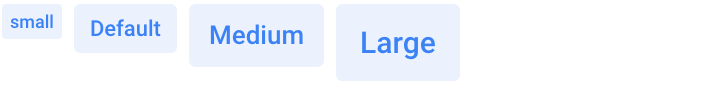
<div class="inline-block rounded-sm bg-blue-500/10 py-0.5 px-1 text-xs font-bold text-blue-500">small</div>
<div class="inline-block rounded bg-blue-500/10 py-1 px-2 text-sm font-bold text-blue-500">Default</div>
<div class="inline-block rounded bg-blue-500/10 py-1.5 px-2.5 font-bold text-blue-500">Medium</div>
<div class="inline-block rounded bg-blue-500/10 py-2 px-3 text-lg font-bold text-blue-500">Large</div>
Button
The badge can also be placed inside the button to display, for example, the number of notifications or necessary actions to perform.

<button type="button" class="btn bg-blue-600/90 font-bold text-white hover:bg-blue-600">
    Notifications
    <span class="ml-2 rounded-sm bg-blue-100 py-0.5 px-1 text-xs font-bold text-blue-500">88</span>
</button>
Pills
Use the .rounded-full utility class to make badges more rounded with a larger border-radius.

<div class="inline-block rounded-full bg-blue-500/10 py-1 px-2 text-sm font-bold text-blue-500">Primary</div>
<div class="inline-block rounded-full bg-teal-500/10 py-1 px-2 text-sm font-bold text-teal-500">Success</div>
<div class="inline-block rounded-full bg-red-500/10 py-1 px-2 text-sm font-bold text-red-500">Danger</div>
<div class="inline-block rounded-full bg-orange-500/10 py-1 px-2 text-sm font-bold text-orange-500">Warning</div>
<div class="inline-block rounded-full bg-cyan-500/10 py-1 px-2 text-sm font-bold text-cyan-500">Info</div>
<div class="inline-block rounded-full bg-light-100 py-1 px-2 text-sm font-bold text-body dark:bg-dark-200">Secondary</div>