Basic example
The list groups are very useful and flexible component for displaying lists of elements in a beautiful manner. The most basic list group is an unordered list with list items and the proper classes. Build upon it with the options that follow.
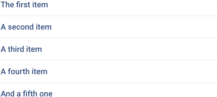
<ul class="font-bold">
    <li class="border-b border-light-200 py-2 dark:border-dark-200">The first item</li>
    <li class="border-b border-light-200 py-2 dark:border-dark-200">A second item</li>
    <li class="border-b border-light-200 py-2 dark:border-dark-200">A third item</li>
    <li class="border-b border-light-200 py-2 dark:border-dark-200">A fourth item</li>
    <li class="py-2">And a fifth one</li>
</ul>
Active item
Use code below to indicate the current active selection.
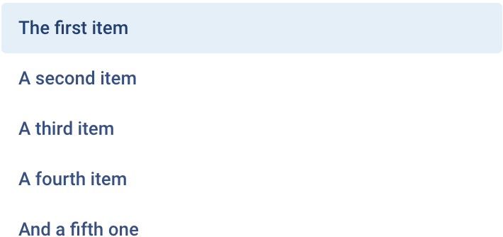
<ul class="font-bold">
    <li class="rounded bg-light-200 py-2 px-3 text-heading dark:bg-dark-200">The first item</li>
    <li class="rounded py-2 px-3">A second item</li>
    <li class="rounded py-2 px-3">A third item</li>
    <li class="rounded py-2 px-3">A fourth item</li>
    <li class="rounded py-2 px-3">And a fifth one</li>
</ul>
Disabled items
The class .text-muted can be used to disable a specific item in the list group.
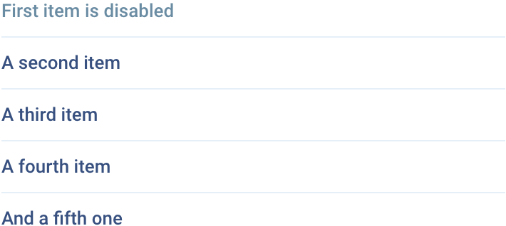
<ul class="font-bold">
    <li class="cursor-default border-b border-light-200 py-2 text-muted dark:border-dark-200">First item is disabled</li>
    <li class="border-b border-light-200 py-2 dark:border-dark-200">A second item</li>
    <li class="border-b border-light-200 py-2 dark:border-dark-200">A third item</li>
    <li class="border-b border-light-200 py-2 dark:border-dark-200">A fourth item</li>
    <li class="py-2">And a fifth one</li>
</ul>
Links
Use <a> or <button> to create actionable list group items with hover, disabled, and active states.
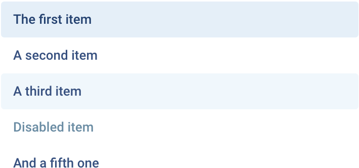
<nav class="font-bold">
    <a href="" class="block rounded bg-light-200 py-2 px-3 text-heading dark:bg-dark-200"> The first item </a>
    <a href="" class="block rounded py-2 px-3 hover:bg-light-100 dark:hover:bg-dark-200">A second item</a>
    <a href="" class="block rounded py-2 px-3 hover:bg-light-100 dark:hover:bg-dark-200">A third item</a>
    <a href="" class="block cursor-default rounded py-2 px-3 text-muted">Disabled item</a>
    <a href="" class="block rounded py-2 px-3 hover:bg-light-100 dark:hover:bg-dark-200">And a fifth one</a>
</nav>