Basic example
Use these default button styles with multiple colors to indicate an action or link within your website.

<button type="button" class="btn bg-blue-600/90 text-md text-white hover:bg-blue-600">Button</button>
Sizes
Use these examples if you want to use smaller or larger buttons.

<button type="button" class="btn h-6 bg-blue-600/90 text-xs text-white hover:bg-blue-600">Extra Small</button>
<button type="button" class="btn h-7 bg-blue-600/90 text-sm text-white hover:bg-blue-600">Small</button>
<button type="button" class="btn bg-blue-600/90 text-md text-white hover:bg-blue-600">Default</button>
<button type="button" class="btn h-9 bg-blue-600/90 text-white hover:bg-blue-600">Large</button>
Disabled
Use the following styles to indicate a disabled button. This can be often used inside form elements to disable the submit button before all the form elements have been completed and validated.

<button
    type="button"
    class="btn bg-blue-600/90 text-md text-white hover:bg-blue-600 disabled:cursor-default disabled:bg-blue-600/90 disabled:opacity-75 disabled:hover:bg-blue-600/90"
    disabled
>
    Button
</button>
With Icons
Followings are the icon usage example with buttons.
<button type="button" class="btn bg-blue-600/90 text-md text-white hover:bg-blue-600">
    <i class="icon mr-1 font-light">mail</i>
    Mail
</button>
<button type="button" class="btn bg-blue-600/90 text-md text-white hover:bg-blue-600">
    <i class="icon mr-1 font-light">check_circle</i>
    Tasks
</button>
<button type="button" class="btn bg-blue-600/90 text-md text-white hover:bg-blue-600">
    <i class="icon mr-1 font-light">account_circle</i>
    Profile
</button>
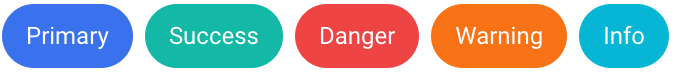
Contextual variants
Use Tailwind’s color classes to contexualize the buttons.

<button type="button" class="btn bg-blue-600/90 text-md text-white hover:bg-blue-600">Primary</button>
<button type="button" class="btn bg-teal-600/90 text-md text-white hover:bg-teal-600">Success</button>
<button type="button" class="btn bg-red-600/90 text-md text-white hover:bg-red-600">Danger</button>
<button type="button" class="btn bg-orange-600/90 text-md text-white hover:bg-orange-600">Warning</button>
<button type="button" class="btn bg-cyan-600/90 text-md text-white hover:bg-cyan-600">Info</button>
Outlined buttons
Use the following button styles to show the colors only for the border of the element.

<button type="button" class="btn border border-blue-600/90 text-md text-blue-600 hover:bg-blue-600 hover:hover:text-white">Primary</button>
<button type="button" class="btn border border-teal-600/90 text-md text-teal-600 hover:bg-teal-600 hover:text-white">Success</button>
<button type="button" class="btn border border-red-600/90 text-md text-red-600 hover:bg-red-600 hover:text-white">Danger</button>
<button type="button" class="btn border border-orange-600/90 text-md text-orange-600 hover:bg-orange-600 hover:text-white">Warning</button>
<button type="button" class="btn border border-cyan-600/90 text-md text-cyan-600 hover:bg-cyan-600 hover:text-white">Info</button>
Rounded
Use elements rounded corners with the .rounded-full property.
<button type="button" class="btn rounded-full bg-blue-600/90 text-md text-white hover:bg-blue-600">Primary</button>
<button type="button" class="btn rounded-full bg-teal-500 text-md text-white hover:bg-teal-600">Success</button>
<button type="button" class="btn rounded-full bg-red-500 text-md text-white hover:bg-red-600">Danger</button>
<button type="button" class="btn rounded-full bg-orange-500 text-md text-white hover:bg-orange-600">Warning</button>
<button type="button" class="btn rounded-full bg-cyan-500 text-md text-white hover:bg-cyan-600">Info</button>