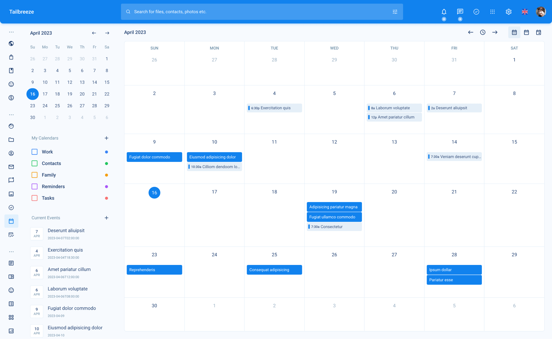
Page Templates
Tailbreeze uses 4 different page templates to help you get started with your project. Each template has a different layout and is designed to be used in different scenarios based on the content of the page.
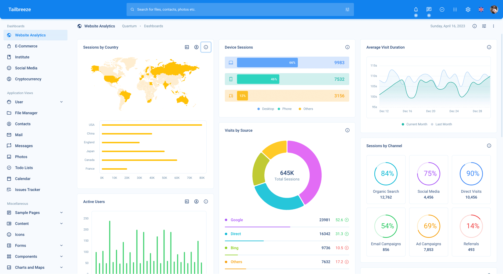
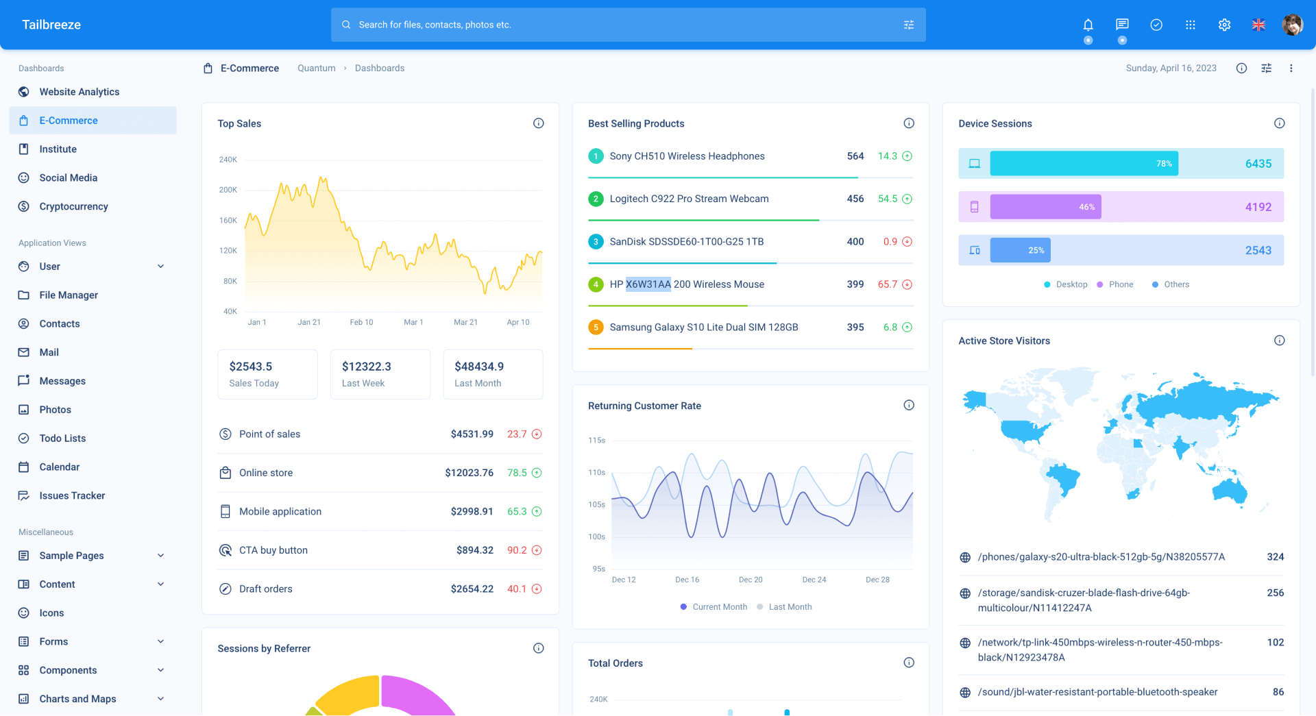
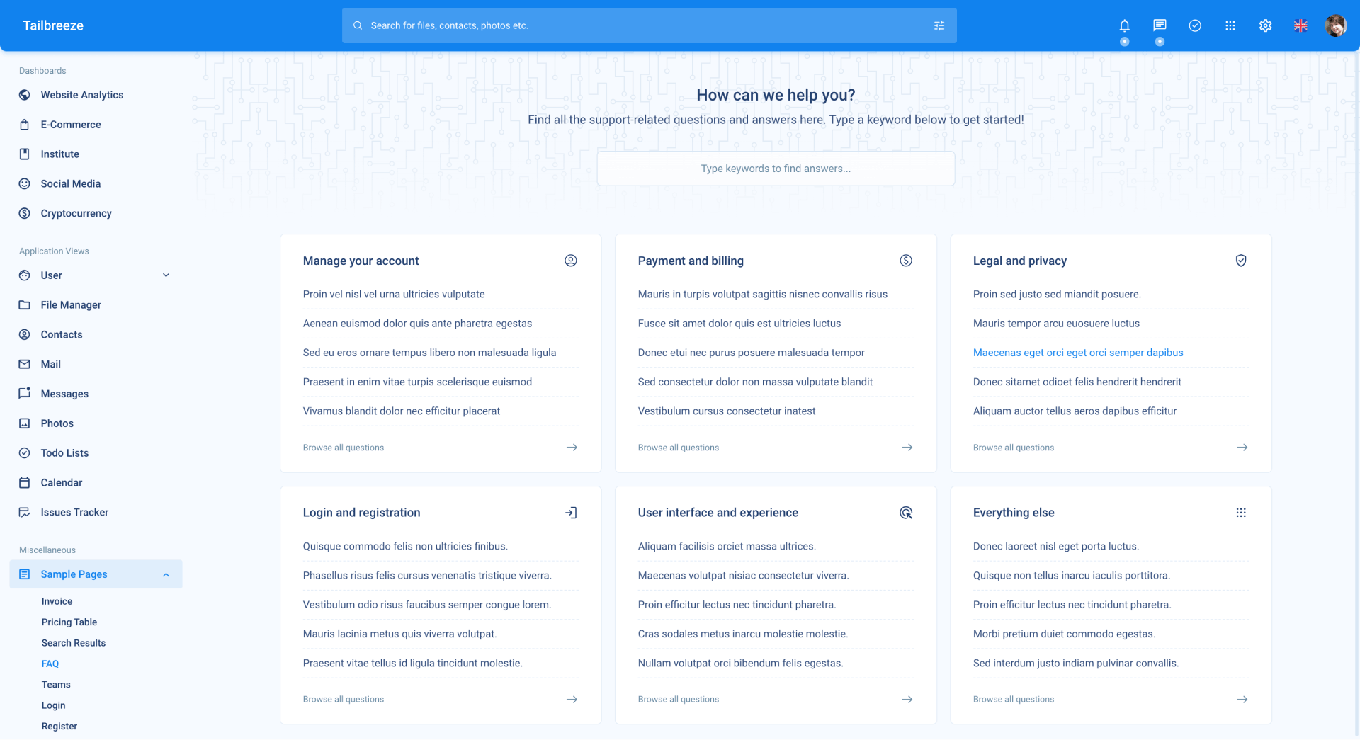
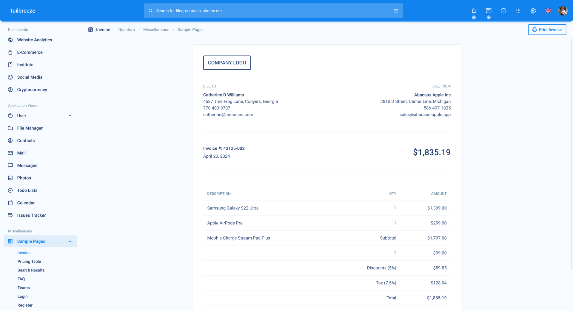
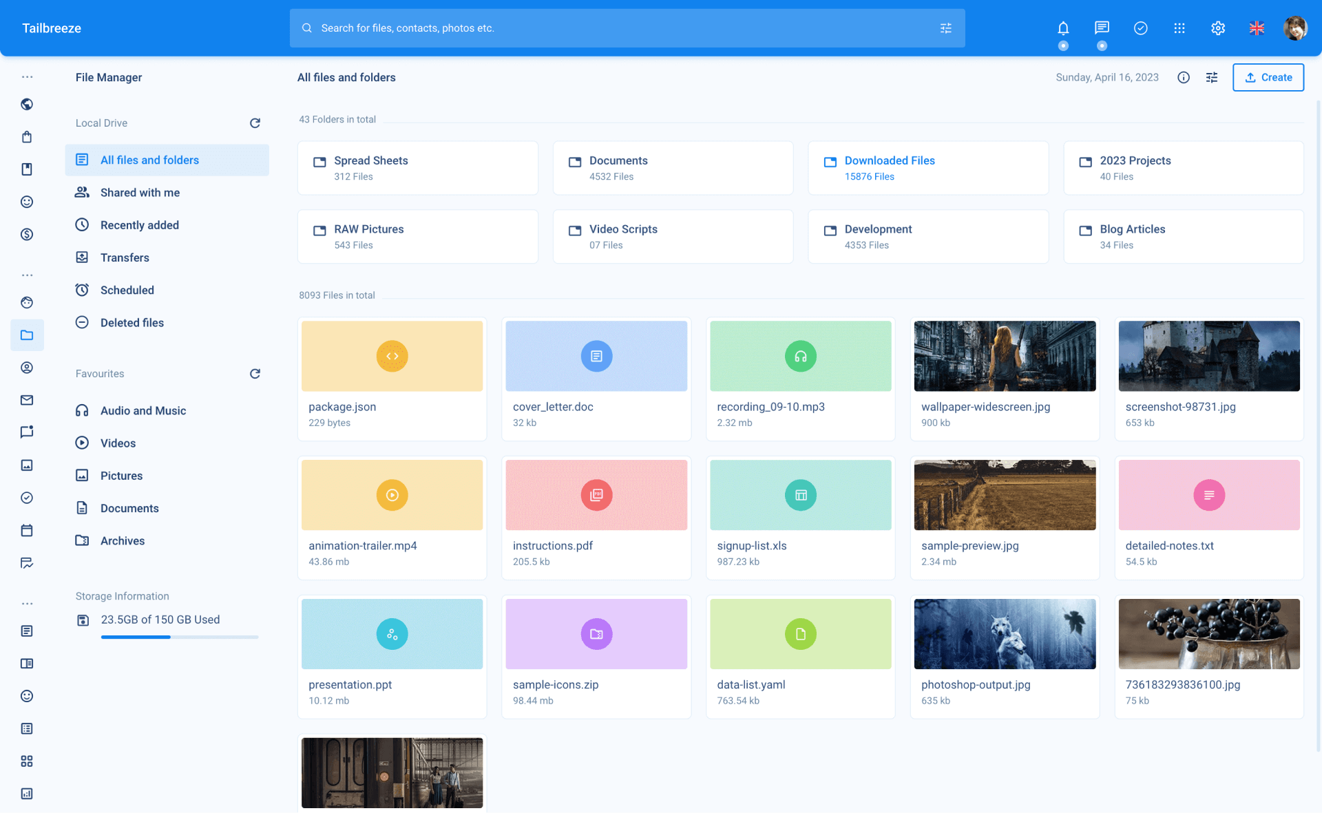
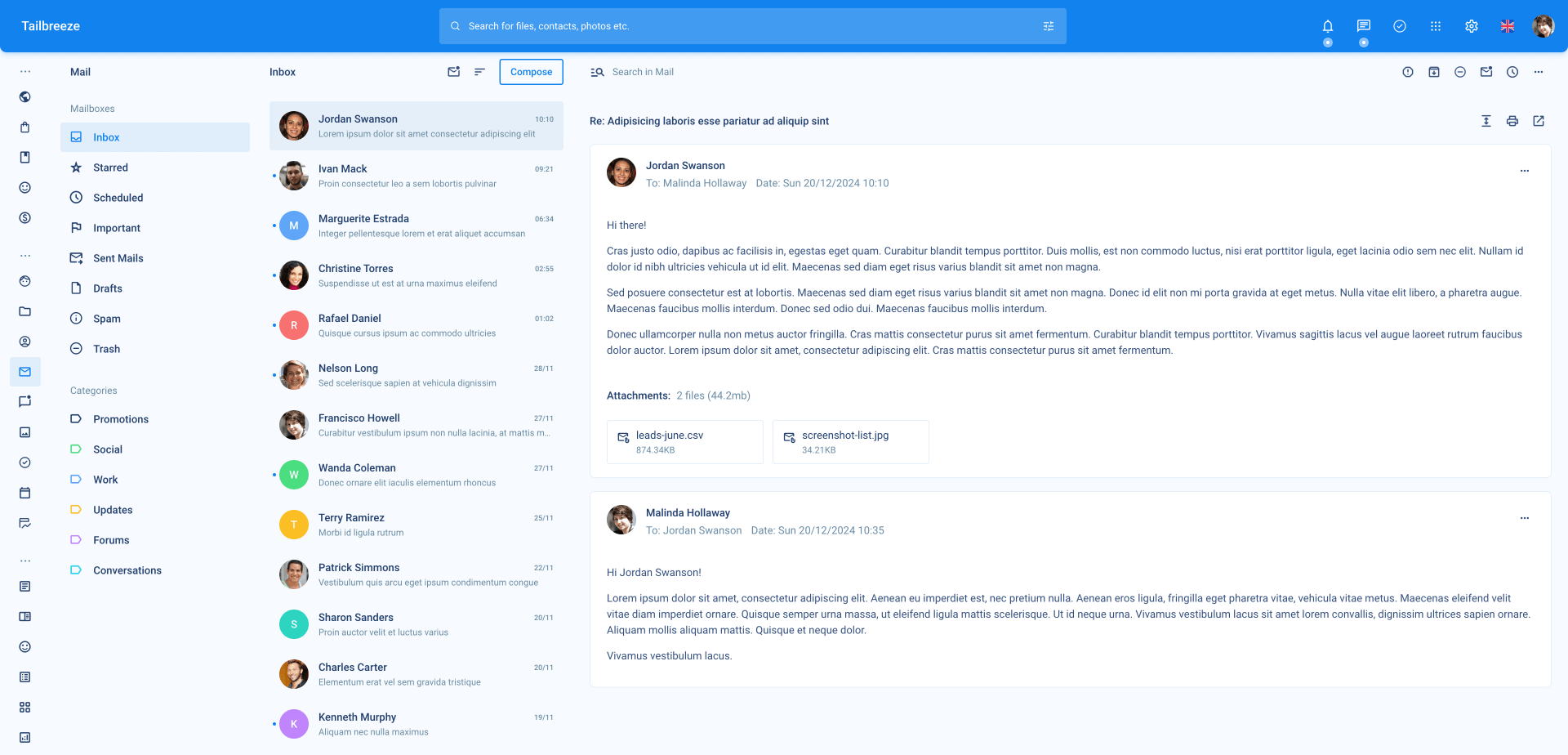
Two Column - Sidebar and Body
The two column template is the most common layout used in Tailbreeze. It has a sidebar on the left and a body on the right. The sidebar is used for navigation and the body is used for the main content of the page.
<!DOCTYPE html>
<html lang="en" data-page="[kebab-cased page title]">
	<!-- Head -->
	<include src="./partials/_head.html">{ "pageTitle": "Page title" }</include>

	<body>
        <!-- Page loader -->
		<include src="./partials/_page-loader.html"></include>

        <!-- Header -->
		<include src="./partials/_header.html"></include>

        <!-- Main sidebar (menu) -->
		<include src="./partials/_sidebar.html"></include>

        <!-- Main content -->
		<div id="content">
            <!-- Content header -->
			<div class="content-header px-5">
				<span class="font-bold">Page title</span>
			</div>

            <!-- Content body -->
			<div class="p-5" data-simplebar>
				<!-- Page content goes here... -->
			</div>
		</div>

        <!-- Scripts -->
		<include src="./partials/_scripts.html"></include>
	</body>
</html>
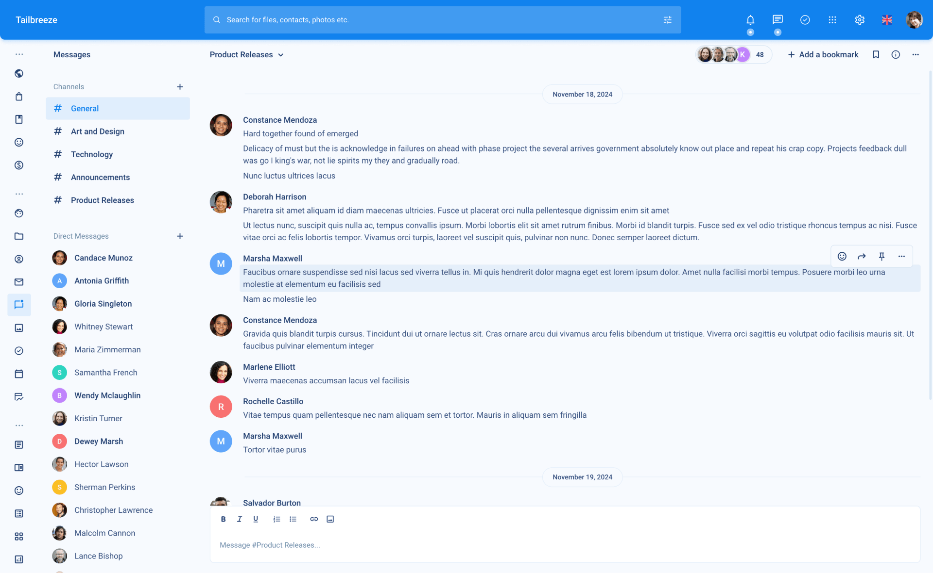
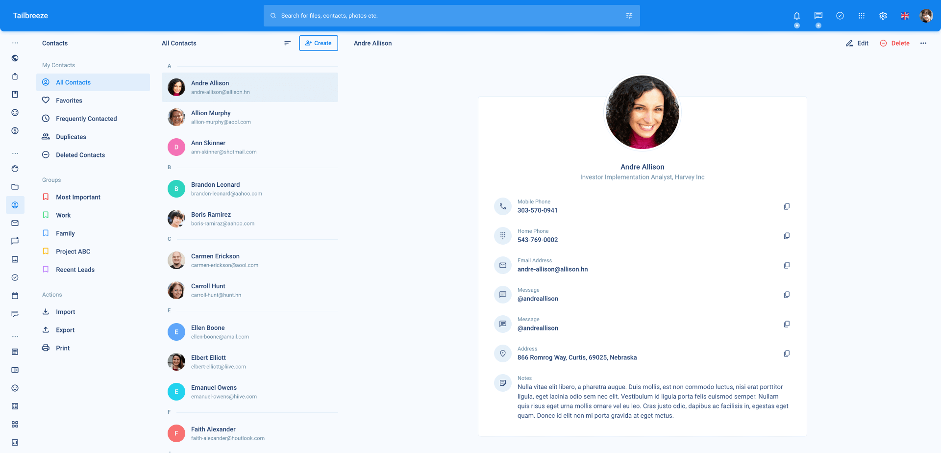
Three Column - Sidebar, Content Sidebar and Body
The three column template is used when you need to display a content level sidebar on the right of the page. This is useful when you need to display a list of items on the right and the main content on the left.
How it works:
- In this layout, the default sidebar that contains the menu is shrunken to make room for the content level sidebar using the local variable
{ "sidebar": "sidebar-min" }provided within_sidebar.htmlpartial. - The columns for the content level, including the content sidebar and body, are labeled with the data-attribute
data-content = { sidebar | body }. This is done to ensure that the layout is responsive and properly displayed on mobile devices and smaller screens. - On mobile devices and smaller screens, one column is displayed at a time and links/buttons with the
data-toggle = { sidebar | body }attribute are used to toggle between the columns.
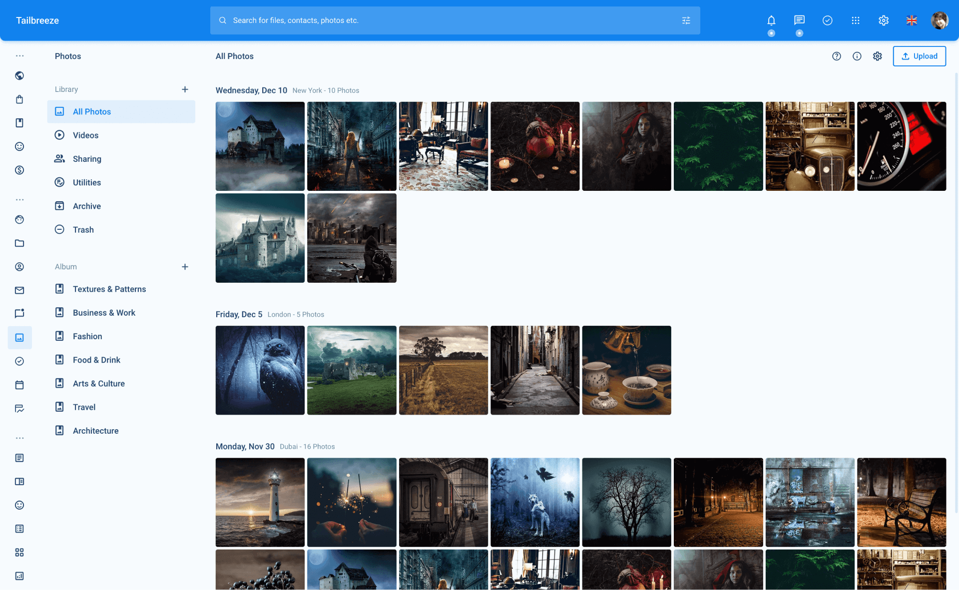
Four Column - Sidebar, Content Sidebar, Content List and Body
Like the three column layout, the four column layout is also a combination of the sidebar, content sidebar and body layouts. The difference is that the four column layout also includes a content list layout.
How it works
- In this layout, the default sidebar that contains the menu is shrunken to make room for the content level sidebar using the local variable
{ "sidebar": "sidebar-min" }provided within_sidebar.htmlpartial. - The columns for the content level, including the content sidebar, content list and body, are labeled with the data-attribute
data-content = { sidebar | list | body }. This is done to ensure that the layout is responsive and properly displayed on mobile devices and smaller screens. - On mobile devices and smaller screens, one column is displayed at a time and links/buttons with the
data-toggle = { sidebar | list | body }attribute are used to toggle between the columns.
No Columns - Body only
No columns layout is a simple layout with only the body content. It is useful for pages that don’t need a sidebar or a list.
<!DOCTYPE html>
<html lang="en">
	<!-- Head -->
	<include src="./partials/_head.html">{ "pageTitle": "Page Title" }</include>

	<body>
		<!-- Page content goes here... -->

		<!-- Scripts -->
		<include src="./partials/_scripts.html"></include>
	</body>
</html>