Variants
Provide contextual feedback messages for typical user actions with the handful of available and flexible alert messages.
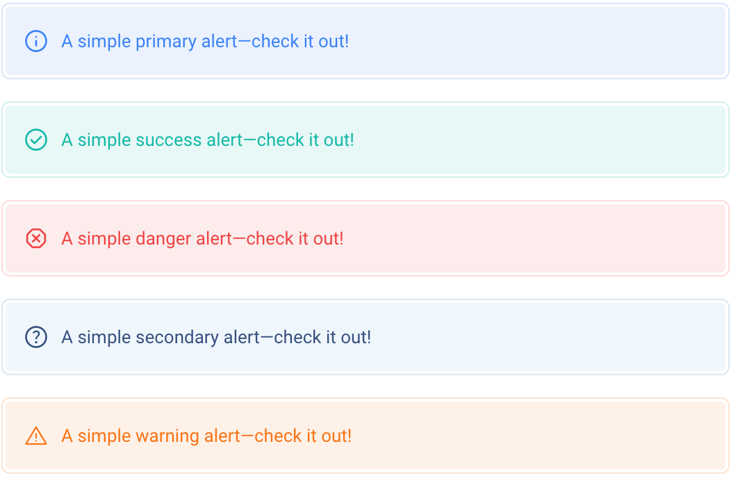
<!-- Primary -->
<div class="rounded-md border border-blue-500/20 p-0.5">
    <div class="flex items-center rounded bg-blue-500/10 p-3 text-blue-500" role="alert">
        <i class="icon mr-2 text-2xl font-light">info</i>
        A simple primary alert—check it out!
    </div>
</div>

<!-- Success -->
<div class="rounded-md border border-teal-500/20 p-0.5">
    <div class="flex items-center rounded bg-teal-500/10 p-3 text-teal-500" role="alert">
        <i class="icon mr-2 text-2xl font-light">check_circle</i>
        A simple success alert—check it out!
    </div>
</div>

<!-- Danger -->
<div class="rounded-md border border-red-500/20 p-0.5">
    <div class="flex items-center rounded bg-red-500/10 p-3 text-red-500" role="alert">
        <i class="icon mr-2 text-2xl font-light">dangerous</i>
        A simple danger alert—check it out!
    </div>
</div>

<!-- Secondary -->
<div class="rounded-md border border-light-300 p-0.5 dark:border-dark-200">
    <div class="flex items-center rounded bg-light-100 p-3 text-body dark:bg-dark-200" role="alert">
        <i class="icon mr-2 text-2xl font-light">help</i>
        A simple secondary alert—check it out!
    </div>
</div>

<!-- Warning -->
<div class="rounded-md border border-orange-500/20 p-0.5">
    <div class="flex items-center rounded bg-orange-500/10 p-3 text-orange-500" role="alert">
        <i class="icon mr-2 text-2xl font-light">warning</i>
        A simple warning alert—check it out!
    </div>
</div>
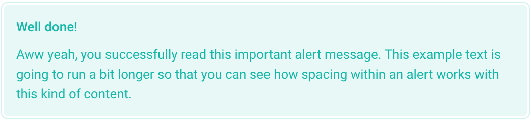
Additional content
Within the alert, you can also place additional elements such as headers, paragraphs, and dividers to be more elaborate and convey more content.
<div class="rounded-md border border-teal-500/20 p-0.5">
    <div class="rounded bg-teal-500/10 p-3 text-teal-500" role="alert">
        <div class="mb-2 font-bold">Well done!</div>
        Aww yeah, you successfully read this important alert message. This example text is going to run a bit longer so that you can see
        how spacing within an alert works with this kind of content.
    </div>
</div>
Dismissing
To skip alerts that the user has already read, we can add an optional close button so the user can easily dismiss it.

<div class="rounded-md border border-teal-500/20 p-0.5" data-tb-alert>
    <div class="flex items-center rounded bg-teal-500/10 p-3 text-teal-500" role="alert">
        <i class="icon mr-2 text-2xl font-light">check_circle</i>
        A simple success alert—check it out!

        <button data-tb-alert-dismiss type="button" class="icon ml-auto text-lg opacity-50 hover:opacity-100">close</button>
    </div>
</div>